The name comes from the concept of liminal space- the threshold between two states, the pause between what was and what's next.
I approached Liminal as a full AI system design challenge, what the product looks like, but also how the AI thinks, decides, and speaks. Liminal is a mood-aware creative companion for designers and makers that matches you to the right creative activity based on your emotional state, blockers, and available time.
Built 0→1 using Figma, Lovable, and the Claude API, I designed the AI matching framework, prompt architecture, and human-AI collaboration model before touching a single screen, proving that AI-native design starts with the intelligence layer, not the interface.
role
AI Product Designer
team
Solo
timeline
2 weeks
stack
Figma, Lovable, Claude
How did it all start?
As a creative professional, I've often found myself staring at the screen — knowing I should be working but feeling mentally blocked. Not lazy. Just foggy.
"Why can't I think straight today?"
That simple question became the seed of Liminal. I wasn't trying to build another to-do list. I wanted to create something that meets creatives where they are, especially on the hard days. But before I designed anything, I needed to know if this was a real, shared problem — or just mine.
I surveyed designers, artists, and digital makers about their creative process. I wanted to understand the emotional texture of their blocks, not just the practical symptoms.
survey findings
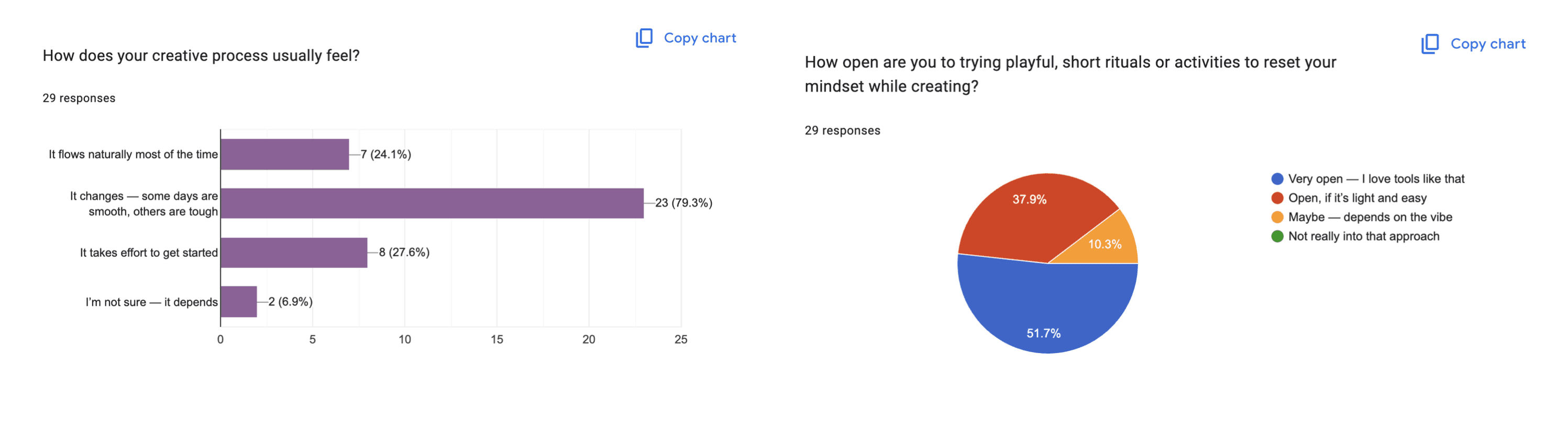
Their responses confirmed a shared emotional rhythm: some days flow, others feel foggy, blocked, or burnt out. Three responses stuck with me:
"It changes — some days are smooth, others are hard."
"I try to push through or talk to people."
"I wish there was something for burnout... or to help get started."
90% of creatives were open to playful, short activities to reset their mindset — if they were light and emotionally attuned. Not one person said they wanted another productivity system.
This validated a core insight that would shape every design decision that followed: creatives don't need more pressure. They need gentle, well-timed support.
design challenge
How might we design an AI-powered companion that turns creative block into creative action?
early explorations
The survey gave me a hypothesis. To test it, I built an earlier prototype- an AI-matched activity tool built entirely in Lovable, without Figma, in two weeks.
It worked, in the narrow sense. Creatives could input their state, get a matched activity, and feel something shift. The logic held. But as I used it and shared it, a ceiling became visible.
The AI matching was a black box dressed as a feature. I was passing user context to a model and trusting it to do something reasonable. I hadn't designed the AI system. I'd integrated one. When context was clear, it felt good. When it was ambiguous, a tired user with conflicting signals, the recommendations felt random. There was no principled way to debug it, because there was no principled framework underneath.
That gap became the brief for Liminal. Same core problem. Completely different approach: start with the AI layer, not the interface.
The earlier prototype was AI-assisted. Liminal is AI-designed. The difference isn't semantic; it shows up in every decision.


Designing the AI System
Starting from the AI layer meant answering questions that most product design processes never ask: What does the AI actually need to know? In what order should it reason? What should happen when inputs conflict?
I took them as design questions and answering them first changed everything about what the interface needed to do.
The context model
Every AI interaction in Liminal is built on a five-variable context object collected at the start of each session. Each variable was chosen because it gives the AI a different dimension of understanding — not just more data.

These five variables create a context fingerprint for each session. No two fingerprints are identical, and the matching system treats them as a whole, not as independent filters. Getting this schema right was the first real design decision — because it determined what the UI needed to ask, and in what order.
The matching framework
Once I had the context model, the question was: what does the AI actually do with it?
The answer was deliberately constrained: the AI's job is not to generate activities. It's to match from a curated library of 37 activities across 7 categories. Curation over generation — this single decision shaped the entire system's reliability.
I designed the matching logic as a prioritisation hierarchy. When the AI receives the five context variables, it doesn't treat them equally:
This hierarchy means the AI is doing reasoning, not retrieval. It's not keyword-matching mood to the category, it's applying a prioritised decision framework encoded into the system prompt. The hierarchy also gives me something to debug: when a recommendation feels off, I can trace exactly which step went wrong.

The three AI interaction patterns
With the matching framework defined, I could design interaction patterns around it rather than the other way around.
Liminal uses three distinct AI interaction patterns, each designed for a different user state and cognitive load. They share the same underlying framework, but surface it in completely different ways depending on what the user needs in that moment.

LIMINAL ai architecture

prompt architecture
System prompt design principles
Every AI call shares a base system prompt built on four principles. I arrived at these through iteration, not upfront planning — each one was the response to a specific failure I observed.
Voice contract: Warm, curious, non-prescriptive. "Let's" not "You should." Invitation over instruction. Why this mattered: early versions felt like a productivity coach. Users in low-energy states found the tone activating in the wrong direction — it added pressure rather than reducing it.
Role definition: Creative companion — not productivity coach or therapist. Creates conditions; does not direct outcomes. Why this mattered: without this constraint, the AI occasionally drifted into advice-giving. That's a different product with different trust requirements.
Constraint acknowledgment: The AI knows it is matching from a defined library and must never invent outside it. Why this mattered: unconstrained generation produced creative-sounding but untested activities. Curation meant every recommendation had been considered at the design stage.
Failure instruction: Ambiguous or conflicting context defaults to Mindfulness or Playful — lowest stakes, highest accessibility. Never a complex ideation activity for "Tired + 5 mins." Why this mattered: without explicit failure handling, the AI would confidently produce mismatched recommendations. Confidence without correctness is worse than uncertainty.
Guided Session prompt structure
SYSTEM: You are liminal, a creative companion for designers and makers.
Your job is to select ONE activity from the provided library that best
fits this user's context. Apply this priority order:
1. Hard filter by time — never exceed available time
2. Match blocker type first — it reveals the real need
3. Respect activity preference modality
4. Use mood to calibrate framing, not activity selection
5. Consider design stage for phase-appropriateness
Return: activity title, full description, and one warm sentence
explaining why this fits this specific moment.
Voice: curious, warm, never prescriptive. 'Let's' not 'You should.'
USER: Name: [name] | Discipline: [disciplines]
Stage: [stage] | Mood: [mood] | Time: [time]
Blocker: [blocker] | Preference: [preference]
[Full activity library — 40 activities across 7 categories]
Journal prompt structure
SYSTEM: Generate one open journal prompt for a creative in this state.
Rules: single question or invitation only. Max 30 words.
Poetic, not clinical. Open-ended — no yes/no answers possible.
Do not reference the blocker directly — approach it obliquely.
Voice: delicate, feeling-forward, Cormorant italic energy.
Post-session prompt structure
SYSTEM: Generate one open journal prompt for a creative in this state.
Rules: single question or invitation only. Max 30 words.
Poetic, not clinical. Open-ended — no yes/no answers possible.
Do not reference the blocker directly — approach it obliquely.
Voice: delicate, feeling-forward, Cormorant italic energy.
Prompt iteration
The most impactful single change: making the matching hierarchy explicit. Early versions listed context variables and asked the AI to "pick the most appropriate activity" — producing inconsistent results. Encoding the explicit priority order (time → blocker → preference → mood → stage) dramatically improved consistency.
The second most impactful change: adding an exclusion list for recent activities. Without it, the AI showed a strong bias toward the first 8–10 activities in the library because they appeared earliest in the prompt context. This was invisible until I started logging outputs systematically — a reminder that AI quality issues often don't surface until you're looking for them.
The Human-AI Collaboration Model
With the AI framework defined, I had to make one more set of decisions most AI products skip: exactly where human agency begins and ends.
This isn't an implementation detail. It's the core trust design of the product. Automate too much and the product feels controlling. Too much friction and the AI adds no value. I mapped this explicitly, as a designed collaboration model.
Where the human always leads
Mood and context input: Liminal never detects or infers how a user feels. Users tell Liminal. This is a grounding ritual — a moment of self-awareness that is itself part of the value. Removing it would make the product feel surveilled, not supported.
Mode selection: The user chooses Guided Session, Chat Buddy, or Journal. The AI adapts to the mode; it never decides which mode the user needs.
Activity acceptance: The AI recommends. The user decides. No auto-start, the recommendation is always an invitation.
Reflection: Post-session reflection is optional. The AI asks one question. The user chooses whether to answer.
Where the AI leads
Matching logic: The AI decides which activity fits best. The user sees the recommendation, not the reasoning, because showing the reasoning would shift cognitive load back to the user.
Conversational pacing: In Chat Buddy, the AI decides when it has enough context to recommend. It manages the pace so the user doesn't have to.
Tone calibration: The AI adjusts its language register based on mood, same activity, and completely different framing for a Tired versus an Inspired user.
Journal prompt generation: The one place the AI has genuine creative latitude. Appropriately, the goal here is unlocking the user's creativity, not constraining it.
Designing for AI Failure
Failure Mode 1 — Conflicting context signals
Example: "Inspired" mood + "Too many ideas" blocker + "Playful" preference — three signals pulling in different directions. Response: The priority hierarchy resolves this: blocker takes precedence over mood. "Inspired + Too many ideas" gets a focusing activity. The system prompt encodes this explicitly so the AI doesn't average the signals into an incoherent middle.
Failure Mode 2 — Vague or minimal input
Example: "Nothing specific" for blocker + "Calm" for mood — low-signal context that could match almost anything. Response: Defaults to Mindfulness or Playful. A "Surprise me" option bypasses context questions entirely and returns a random activity — normalising low-effort entry as a valid and welcome choice, not a failure state.
Failure Mode 3 — Tone mismatch
Example: Technically correct activity recommendation, framed with too much enthusiasm for a "Tired + Numb" user. Response: Mood is used exclusively for tone calibration, with per-state guidelines in the system prompt: "Tired users: quieter framing, shorter sentences, acknowledge the low energy before the invitation."
Failure Mode 4 — Repetition across sessions
Example: A frequent user starts receiving the same activities, eroding the sense of discovery. Response: Session history stored in state; last three activity titles passed as an exclusion list in the prompt. Future: lightweight AI memory via persistent session logs for longer-term pattern avoidance.
Evaluating AI Quality
Relevance: Does the activity match the blocker and time constraint? 94% of test sessions produced a recommendation within the correct time constraint. The 6% failures all occurred with conflicting high-time / low-energy signals — now handled by Failure Mode 1.
Tone fidelity: Does the AI language match Liminal's voice? Tone mismatches occurred in 4 of 30 sessions, all in "Tired" or "Numb" states where the AI defaulted to its baseline warmth rather than dialing down. Updated system prompt resolved this in subsequent testing.
Constraint adherence: Does the AI ever recommend outside the library or exceed the time constraint? Zero instances across all test sessions after the exclusion list was added.
Journal prompt quality: Can the prompt be answered yes/no? Does it presuppose an answer? 2 of 15 generated prompts failed this test in early iterations — both used the word "did," implying a completed action. Prompt rules updated to exclude past-tense constructions.
Reflection question quality: "What surprised you today?" passes. "Did you achieve what you wanted?" fails.
visual brand design

liminal experience
home screen

Guided Session
Chat Buddy

Journal

discover

Early Validation
What the numbers showed
Guided Session had near-complete completion across all users- the structured five-question flow removed enough friction that people followed through without prompting. Chat Buddy had a 60% drop-off rate, with most users switching to the sidebar activity after 3-4 exchanges. This meant the sidebar was doing its job, surfacing a recommendation early enough that users trusted it and acted. Journal was used by 20% of users, all of whom had an existing journaling practice. Right scope, right audience.
What users said
The most consistent feedback was about atmosphere; users reported a mood shift before completing the check-in. The environment was doing emotional work before the AI was involved at all. The activity recommendation was described as "low effort, quick, and refreshing." The delightful moment was the anticipation before the recommendation landed; users were genuinely curious what would be surfaced. That moment confirmed curation over generation was the right call.
What changed
Chat Buddy's prompt was updated to move toward recommendations faster when the context is clear. A journal textarea was added to the post-session screen for all modes because users were writing 3-4 sentences after activities unprompted, regardless of which mode they'd used. The design followed the behaviour.
What I Learned
Three principles I'm taking forward:
Design the AI's decision framework before the interface. The prompt is an interface. The matching logic is interaction design. These deserve the same rigour as a screen layout.
Define failure modes as design requirements, not edge cases. Every AI product will fail. The question is whether you designed the failure or left it to chance.
Control beats convenience at the human-AI boundary. Every place you could automate a human step is a decision, not a default. The places where Liminal keeps humans in control are precisely where the AI's contribution feels most trustworthy.