How designing AI first changes the product

A few months ago, I finished a project I’ll call the prototype. It was a creative productivity tool built entirely in Lovable- no Figma, no traditional design tools. Just me, an AI builder, and a problem I cared about: why do creatives get blocked, and what could a well-timed nudge do about it?
The prototype worked, in the narrow sense. The logic was sound. Creatives answered a few questions about their mood and blockers, and the AI matched them to a micro-activity, a 10-minute creative exercise designed to break inertia. Testers responded well, and it was working.
But I could see the ceiling clearly. The AI was a black box dressed as a feature. I was passing context to a model and trusting it to do something reasonable. I hadn’t designed the AI system. I’d integrated one. There’s a difference, and it shows in every edge case, every inconsistency, every moment where the output felt slightly off but you couldn’t say why.
So I started over. Same problem, deeper answer. The project became Liminal.
The question I hadn’t asked
With the prototype, I started with the UI. I designed the screens, wrote the prompts, and hoped the AI would behave. Sometimes it did. Sometimes it recommended a 15-minute activity to someone who said they had 5 minutes. Sometimes it gave an energising prompt to someone who said they were exhausted. The outputs were plausible but not reliable.
The question I hadn’t asked was: what does the AI actually need to know to get this right? And once it has that information, how should it reason through it?
These were system design questions, and they need to be answered before I open Figma.
Starting with the intelligence layer
The first thing I did for Liminal was map the AI as a system. Not a feature. Not a call to an API. A designed set of behaviours with clear inputs, a defined decision process, and explicit failure handling.
I identified five variables that together create a complete picture of where a creative person is on any given day: their design stage, their mood, their available time, their blockers, and their preferred activity type. Each variable was chosen deliberately. Together they form what I started calling a session fingerprint — a unique combination that the AI uses to reason its way to a recommendation.

Then I designed the matching logic as a prioritisation hierarchy. Not “pass all five variables and let the model figure it out.” That’s how you get inconsistent outputs. Instead, Time is a hard filter applied first — never recommend something longer than the user has available. Then the Blocker type takes priority over everything else. It’s the most diagnostic variable; it reveals the real problem beneath the mood. Then Activity preference, then Mood for tone calibration only, then Design stage.
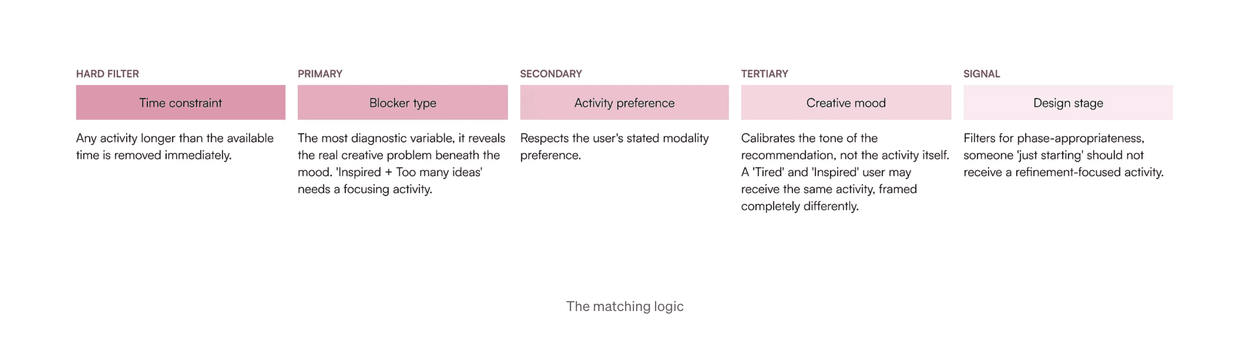
This hierarchy is encoded explicitly in the system prompt. The AI doesn’t average the signals. It works through them in sequence, like a decision tree I designed and handed it.
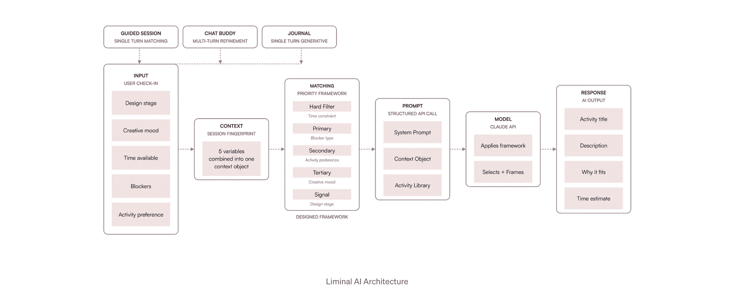
How designing the AI changed what went on the screen
Here’s the thing nobody tells you about AI-native product design: when you design the intelligence layer first, it changes what you put on the screen and what you leave off it entirely.
When I understood that blocker type was the most diagnostic variable — more revealing than mood, it became more prominent in the UI flow. It got its own dedicated question screen with more specific options. The prototype had asked about mood first because that felt intuitive. Liminal asks about the design stage first, then the mood, because that’s the order that gives the AI the clearest picture. The UI is serving the AI’s information needs, not the other way around.
When I understood that mood should calibrate tone but not drive activity selection, I stopped treating it as the primary input. The chip options changed. The framing changed. A user who is tired and a user who is inspired might receive the same activity, but the AI presents it in completely different ways to each. That distinction only becomes possible when you’ve designed the AI’s reasoning explicitly enough to know what each variable is actually doing.
The principle that changed everything
Control beats convenience.
Every place in Liminal where I could have automated the human step, I chose not to. Mood detection. Mode selection — Guided Session, Chat Buddy, or Journal. Auto-starting activities after a recommendation. Each of these felt like an obvious improvement when I thought about them as UX features. Each of them felt like a mistake when I thought about them as AI system design decisions.
When someone is creatively blocked or emotionally foggy, which is exactly when they’re using Liminal, being read by an AI without consent feels invasive. It breaks trust at the moment trust matters most. The manual input step is not friction, but it’s a grounding ritual. A moment of self-awareness that is itself part of the value, before the AI gets involved at all.
The AI recommends. The human decides. No auto-start. The recommendation is always an invitation.
This boundary of designing it explicitly, not leaving it to convention, is what makes the AI feel trustworthy rather than presumptuous. And it’s a boundary I would never have known to draw if I hadn’t started from the intelligence layer rather than the interface.
What I designed for failure
There’s one more thing the prototype never had: designed failure modes.
When the AI got it wrong in the prototype, it got it wrong silently. A confident recommendation that missed the mark. No fallback, no graceful degradation, just an output that felt off and a user who didn’t know why.
For Liminal, I mapped four specific failure modes before building anything: conflicting context signals, vague or minimal input, tone mismatch, repetition across sessions, and designed explicit responses to each.
Conflicting signals resolve through the priority hierarchy, not by averaging. Low-signal context defaults to the lowest-stakes activity categories. Tone mismatch is handled by per-state guidelines in the system prompt. Repetition is blocked by passing the last three activity titles as an exclusion list in every prompt call.
Treating failure modes as design requirements and not edge cases to be handled later meant the most fragile moments of the product got the most design attention. It’s also why Liminal behaves consistently in the moments the prototype never could.
What actually changed
Liminal and the prototype solve the same problem. They look similar on the surface. But they’re fundamentally different products because of where the design process started.
The prototype started with screens. Liminal started with a decision framework. The prototype trusted the AI to figure it out. Liminal tells the AI exactly how to reason. The prototype had good vibes and inconsistent outputs. Liminal has a designed intelligence that behaves predictably and screens that were shaped by that intelligence rather than placed on top of it.
The work that happened before I opened Figma is the work that made Liminal good. The UI is the last thing I designed.
If you’re a designer moving into AI product work, this is the shift I’d push you toward: before you think about interfaces, think about the system. What does the AI need to know? How should it reason? Where should it fail gracefully? The answers to those questions will design your screens for you.