connect the dots
Empowering Gen Z to Form Educated Perspectives Through Wikipedia
Wikipedia has been the world's knowledge repository for over 20 years, yet Gen Z struggles to navigate its depth and find their voice within it. Through participatory research and co-design workshops, we identified an opportunity: leveraging Wikipedia's multifaceted content to help users develop well-rounded, well-informed points of view.
This case study documents how we designed Connect the Dots, a feature that seamlessly integrates into Wikipedia to help Gen Z explore multiple perspectives, understand how topics evolved over time, and contribute their own informed viewpoints.
role
Product Designer
team
4 Product Designers + Product Manager
timeline
12 weeks
impact we aim to create
Elevating Gen-Z's interaction with Wikipedia beyond passive consumption to active exploration.
Enhancing the credibility and relevance of Wikimedia’s offerings in the eyes of a discerning generation.
Providing tailored content journeys that cater to varied interests, promoting a multifaceted understanding of critical issues.
Equipping youth with the tools to critically assess and engage with socially relevant topics.
Research foundation
Through participatory research and Movement Strategy 2030 co-design workshops, we identified that Gen Z needs more than information access; they need scaffolding to navigate complex topics, understand how issues evolved over time, and develop their own informed perspectives. Wikipedia’s multifaceted content became our foundation: leveraging its existing depth to help users explore multiple viewpoints and connect abstract concepts to personal relevance.
design philosophy
Building on these insights, we established four guiding principles rooted in our research findings. These principles served as our compass throughout the design process, ensuring every decision honored both user needs and Wikipedia’s values:

design CHallenge
How might we help Gen Z users navigate Wikipedia's depth to develop well-rounded, informed points of view without disrupting the platform's familiar experience?
What is 'connect the dots'?
Connect the dots provides readers with a customizable way to explore a curated collection of information, tailored to various interests, promoting critical thinking and helping readers develop their own informed points of view.
By synthesizing Wikipedia's scattered, multifaceted content into organized pathways, we enable users to see how different perspectives, historical context, and human impact connect, moving them from passive consumption to active, critical engagement with complex topics.

Entry Point & Split-Screen View
The "Dive Deeper" button in the right sidebar serves as the entry point to Connect the Dots. When clicked, it opens a split-screen view that displays synthesized information alongside the original Wikipedia article, allowing readers to maintain context while exploring curated insights.
Design Decisions:
Positioned sidebar: Our research showed Gen Z values autonomy; they don't want features pushed on them. We placed the feature where users already expect supplementary tools, making it discoverable without being intrusive.
Split-screen: In usability testing, users felt disoriented when synthesis replaced the article entirely. With split-screen, users can reference the original text without holding everything in working memory.

Entry point through 'dive deeper' button
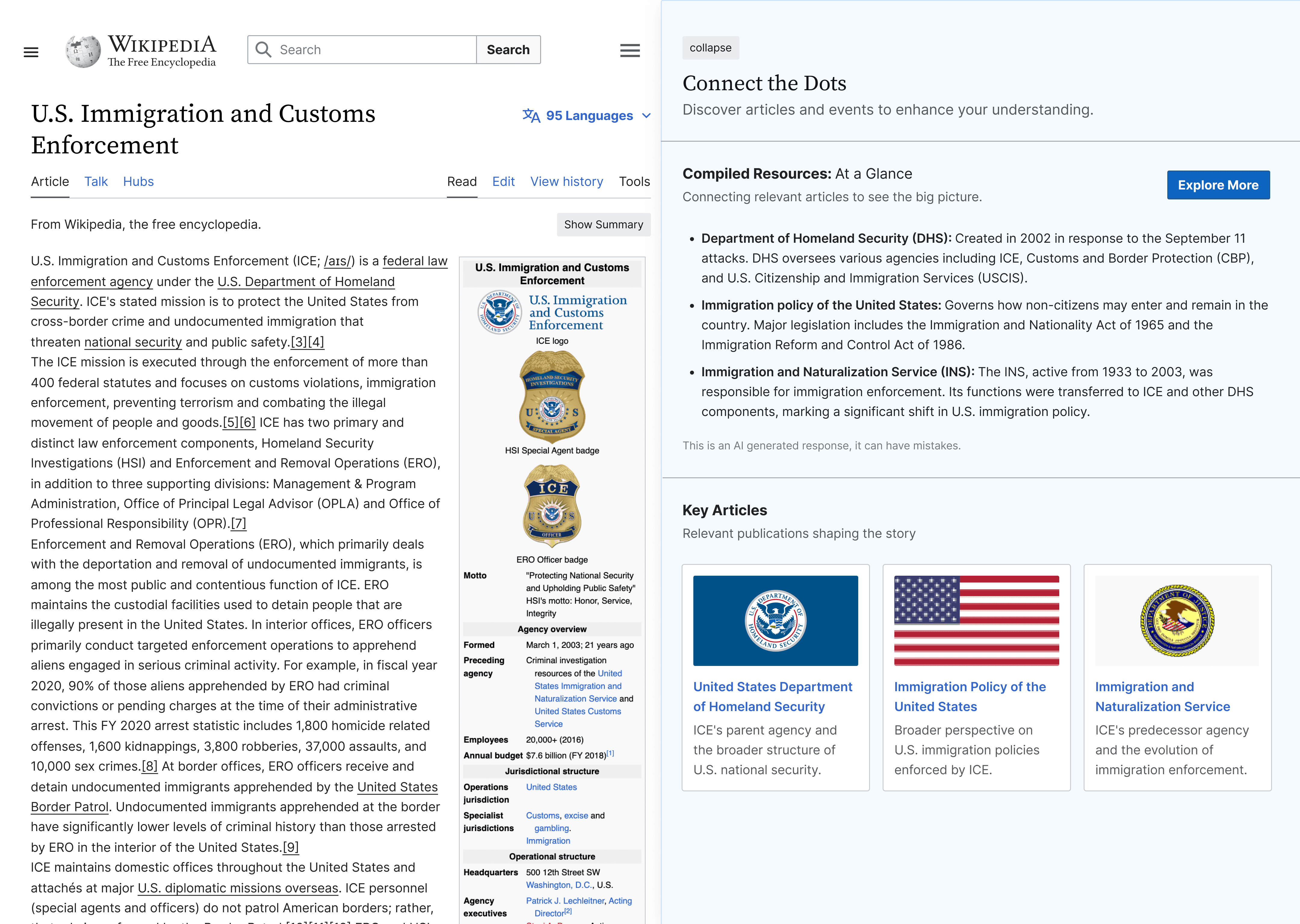
Split view with 'connect the dots'
visual timeline of information
When readers select the Timeline tab, they are presented with a visual timeline of information related to the topic. This feature highlights key events and developments over the years, providing a quick and comprehensive view that enhances their understanding of the topic's historical context and evolution.
Design Decisions:
Spatial metaphor: Our research showed Gen Z struggles to understand how topics evolved over time. We used horizontal space to represent time, a universal conceptual metaphor that leverages spatial mapping (our brains naturally understand 'earlier' as left and 'later' as right).
Created preview/detail pattern: The timeline dots showing '3 events' but not revealing details create controlled curiosity; people remember uncompleted tasks better. Users must click to complete understanding.

multiple lenses through Compiled Resources
This section offers a synthesis of the topic through various social and civic criteria, such as key points, historical comparisons ("Then vs. Now"), policies and actions, criticisms, and human impact. It provides a well-rounded overview, integrating diverse perspectives to enhance readers' understanding of the topic.
Design Decisions:
Tabbed categories: Connect the Dots provides multiple lenses on each topic. Showing everything at once would overwhelm users. We applied Progressive Disclosure: a few important secondary tabs (Key Points, Then vs. Now, Policies and Actions, Criticisms, Human Impact) let users choose which lens interests them, reducing decision paralysis.
Maintained visual equality: Any visual hierarchy can inadvertently suggest certain perspectives matter more; identical treatment signals that all views are equally valid parts of a set.

Conversation Hubs for critical engagement
Hubs are interactive spaces on Wikipedia where users can discuss and share insights on specific topics. They offer curated information, encourage community contributions, and facilitate diverse perspectives, enhancing understanding and engagement through collaborative discussions and a centralized collection of resources.
Design Decisions:
Created conversation spaces: Our research revealed Gen Z struggles to find their voice—they consume information but rarely contribute. Wikipedia's editing interface presents a steep learning curve. We created spaces that feel like discussion forums rather than wiki editing interfaces, applying Fogg's Behavior Model (Motivation × Ability × Prompt).
Used social proof: Showing participant counts and discussion activity signals that participation is normal and expected. Research shows people are more likely to contribute when they see others already engaged.

What We Achieved
Seamless integration: We created a feature that feels like a natural extension of Wikipedia, not a disruptive addition
Multiple pathways to understanding: Timeline, Compiled Resources, and Hubs offer different ways to engage based on learning preference
Visual neutrality: We presented multiple perspectives with equal weight, maintaining platform integrity
Lower contribution barriers: Conversation Hubs provide accessible entry point without requiring wiki markup knowledge
Visible patterns: Timeline and organized perspectives make Wikipedia's existing depth discoverable and navigable

Reflection
By organizing Connect the Dots around four distinct features, each addressing specific user needs while reinforcing our core philosophy, we created multiple pathways for Gen Z to engage with complex information. The Entry Point and Split-Screen provide immediate, transparent access. The Timeline reveals chronological patterns. Compiled Resources organize diverse perspectives. Conversation Hubs lower contribution barriers.
Most importantly, we stayed true to our four guiding principles throughout each feature: we got out of the way (Immediacy), we built flexibility rather than rigid paths (Think Canvas), we created intimate spaces for connection (Hubs), and we made Wikipedia's depth visible through clear structure (Highlighting Authenticity). The result feels like Wikipedia has always worked this way.